Mise-en-scène 101
Mise en scene – I think you’ll agree with me when I say It’s REALLY hard to understand and why it’s important to filmmaking.
Or is it?
Well, it turns out, you can dramatically increase your filmmaking skills by understanding these simple 15 principles…
In today’s post (and infographic) I’m going to show you exactly what those principles are…and how you can easily incorporate them into your storytelling.

How do you define mise en scene? The definition of mise en scene is the difference between authenticity and forced, cheap, or amateurish filmmaking because of the tone.
In some cases, complexity of design sends the right message about mise en scene in film:
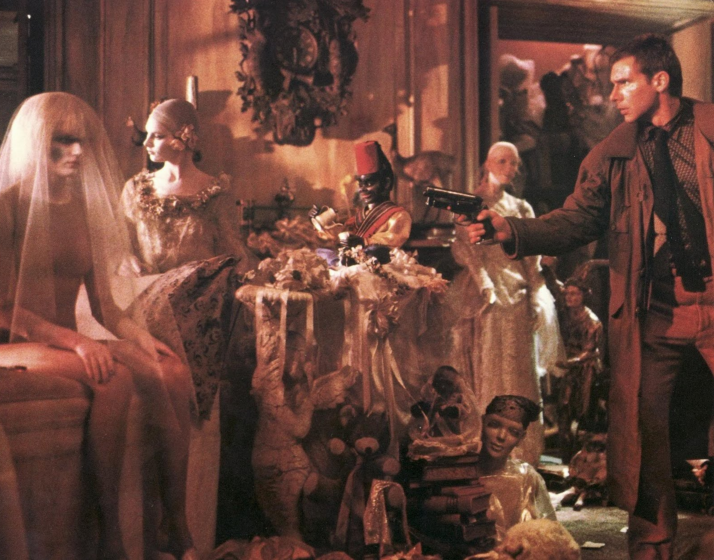
Here, we see a busy space fraught with decrepit objects and potential threats. The primary threat is hiding in plain sight. The audience knows this, the protagonist does not, and therein lies the drama.
Then, there’s simplicity:
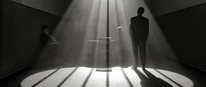
Simple as it gets: a room, a table, some chairs, a few characters, and a single light source. The drama is in the blocking of actors and stunning lighting. If you haven’t seen the film, you still get a good sense for tone, who holds power in the scene, and what is happening.
These are two powerful and very different uses of mis en scene. Cinematic language is created as a result of how the filmmakers laid out the scene.
And then, there’s a middle-ground:
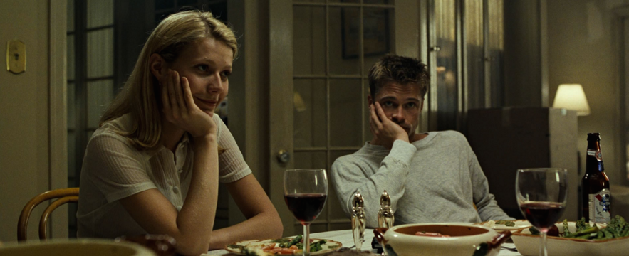
This frame is, for lack of a better term, “lived-in.” It feels like a home you’ve likely been to, and tells us a great deal about those at the table. The food is picked over, the furniture is inexpensive or secondhand, doors are open, and lights are on in other rooms. The drinks are at varying stages of completion, and Brad Pitt is the only one with a beer (PBR, no less).
But wait! here’s a different kind of middle-ground, from the same film:
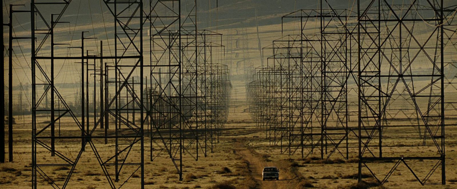
It doesn’t get much simpler than a lone car on a road through the middle of nowhere. But isolation becomes claustrophobic when the road is densely lined with a forest of transmission towers. With this shot, David Fincher created two conflicting emotions simultaneously.
Your film’s miseenscene will dictate the story being told and the desired emotions you wish to insight—not just what seems cool or interesting, for its own sake, because it’s what is right for the film.
MISE EN SCENE CHALLANGES
One common misconception is that quality design and art direction are cost and labor intensive. The time it takes to adequately dress a set justifies hiring an individual to do the job.
Hiring a professional production designer ensures that a pair of eyes will hone the film’s mise en scene, and that you the filmmaker will be responsible for clearly articulating, but not micromanaging your vision.
Filmmakers without a production design budget have to take the endeavor on their shoulders. They’re generally doing many people’s jobs, challenging their ability to do any one well.
In either case, the devil is in the details. Production design on many films fails due to lack of attention. On set, or in the whirlwind of pre-production, it’s easy to overlook a minor facet in a big puzzle. But that minor facet could really pop in a finished frame.
Filmmakers can never have too much forethought. Any extra time pre-planning design furthers a unified vision, and will:
- Answer most design-related questions before they’re asked
- Help you and/or your team problem solve through creative snafoos, and
- Create consistency of voice throughout the entirety of your film.
Not to mention, time spent strategizing can save a lot of money, in the end!
MIS-EN-SCENE PREP
Filmmakers must lean heavily on pre-production to accomplish cohesive and authentic mise en scene, at any budget.
Whether you have a crew of two or two hundred, pre-production establishes how details are addressed, and what it will take to make your film as close to your vision as possible.
Prep is where money becomes a problem and/or starts to make sense. And, it’s where most logistical decisions are made.
There are three pivotal production design conversations that need to take place in prep, no matter your crew size:
- What does the story need? Go through the script scene by scene, from start to finish. Take a careful look at narrative demands. What is the overall tone? What locations are needed? Will you build the locations, found, dressed, or some combination? Be realistic and detail-oriented when identifying visual motifs at the heart of each scene.
- Can production afford the money and time required? Does your film’s budget reasonably permit your vision? If money’s too tight, it probably won’t work. More often than not, it’s better to look at alternatives than force something grand with few resources.
- Can production cut financial corners to meet those requirements? Do you have a family member with a house or office that fits a location in your script? Could you borrow decorum from a friend who sells antiques? So long as your cost-cutting isn’t a safety liability, you should investigate the most cost-effective options.
- Can you augment the script to the production’s means? If you’ve exhausted all alternatives, and are still cutting it financially close, think about whether certain scenes could take place in different locations or under different circumstances? Can you reuse a location that’s already in your film, re-purpose props you already have, or substitute in a new location you know you can get for free, or cheap.
I’m completely sure that our first feature would have come together better were Michael and I to have had these in-depth conversations.
This analysis of your film should be as detailed as possible. If you don’t have a production designer, it may help to run your script by a friend and see what physical specifics jump out at them? Ask your actors to identify set pieces or props they know you’ll need.
Leaning on people you know or others you’re working with takes the pressure off you to be constantly aware of the minutia.
EXAMPLES IN FILM
There are two types of sets: sets you build, and sets you find.
On larger films, the expense of building a set is justified by the time it saves. It can help to have sets in a controlled environment that won’t require mass transport of crew and equipment.
On a small budget, you won’t have that luxury, so it helps to think of locations as complete solutions: a location you decide on should solve more foreseeable problems than it causes, with little need to bring or build additional stuff.
Let’s look at two Kubrick films and distinguish between what you bring/build and what’s there:
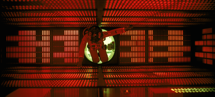
Locations like this didn’t exist in nature or the world of 1968. 2001: A Space Odyssey was built, and Kubrick had the resources to do so, from the ground up. Constructing this set was not only the best option, but the only one given the story he was telling.
Had he not been making the film for MGM, he might’ve found cheaper alternatives. But Kubrick was given adequate means. Having this and other sets on a soundstage was most cost effective; much of the film’s shooting was consolidated to MGM Studios.
When creating a set from nothing, the primary challenge is to design and construct authenticity. Much of this is also solved in photography. But, authenticity has different context for every film.
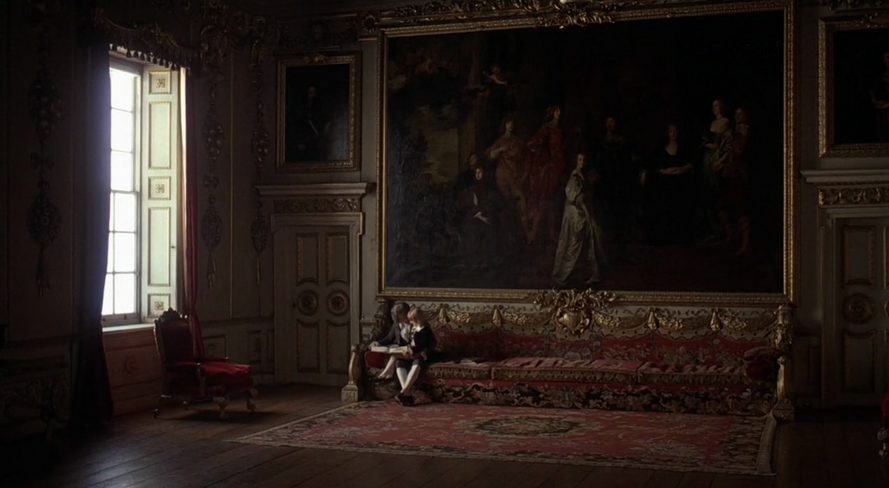
This Kubrick frame showcases a completely opposing approach: most of Barry Lyndon, was shot on existing locations of the period. It would have cost far more to recreate these ornate sets than it did to travel and film them, as they were.
Barry Lyndon’s period was one of great excess, and buildings were constructed with lavish detail and financial frivolity. There’s no better way to capture this than going to the source. The crew wasn’t required to bring much besides costumes and gear, as many of these locations were well maintained historical sites. Authenticity was inevitable.
Kubrick oscillated between these two production design styles throughout his career. Much of Full Metal Jacket was shot in an abandoned English town, The Shining was almost exclusively shot on a soundstage, and A Clockwork Orange was a hybrid, heavily dressing found locations.
You should see both approaches for their unique perks, the level of control they afford, and the monetary conditions that come with them.
Both solve unique problems, require inventiveness, and a detailed eye.
MISE EN SCENE ANALYSIS
Pay attention. Once on set, pay close attention to what you can and cannot manipulate within each frame. Address the limitations beforehand. Dress accordingly.
If you’re on-location, your ability to rearrange certain set pieces may be restricted. If items in frame are distracting or ill-fitting, you may have to re-frame entirely or slightly adjust framing to make shots work.
Conduct mini pre-productions before each shoot.
Michelangelo Antonioni—who preferred shooting on-location—was known to walk on set twenty minutes before the rest of the crew. He’d spend that time quietly, and almost meditatively, observing the space, framing and blocking each sequence in his head.
While this practice is easily afforded to someone with extra time and money, low-budget filmmakers can take a similar approach. If you’re shooting at a friend’s house, visit a week before, bring beers, and have a look around. If you’re shooting at a restaurant, eat there and spend that half hour or so scoping the layout.
Have a plan, and when it comes time to execute ensure that the feeling you want to convey is showing through.
Antonioni used the term, “the psychological landscape,” referring to the environment surrounding the characters as a means of exploring their innermost feelings.
Low budget filmmakers depend on this extrinsic world. The possibilities will seem endless if you’re attentice. Focus on those possibilities that best fit your narrative.
Every prop should look like it belongs; sets should feel authentic to the story’s world.
MISE EN SCENE DESIGN (INTERVIEWS)
Production design in documentaries is often underestimated. A thought-out frame can shape the audience’s perception of the expert, witness, or character being interviewed.
Mise en scene is the difference between interviewing a doctor in a park, or in front of the wall in her office where her certifications, diplomas and awards hang. If you’re interviewing a competitive hunter, you’ll want to find the room full of antlers and pelts.
Or, there is the option of completely controlling the environment: taking the interview off-location, to a strategically lit studio setting.
Think of what you want the interview to say, beyond the words. Interview soundbites dictate what the audience thinks. The look of the interview shows them how to feel. The power of good documentarianism is beyond simply relaying information. That’s Wikipedia’s job.
Take these examples:
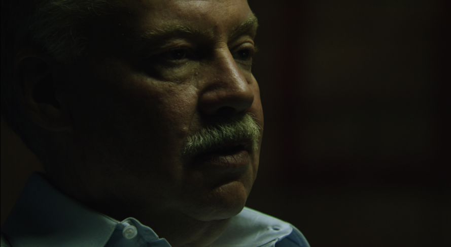
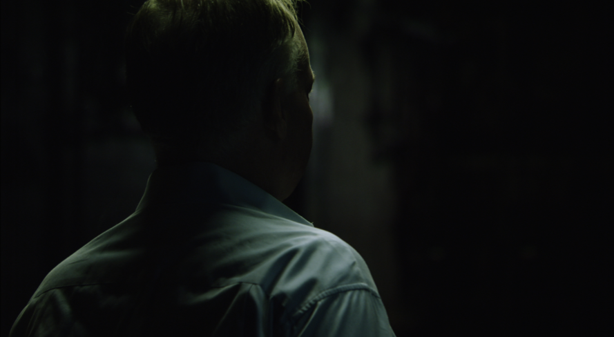
In this first example, Collapse, Michael Ruppert is interviewed in a tonal, dramatically lit space. It feels large, cavernous, and mysterious, as though the filmmakers took him to an abandoned and remote facility on the fringe of society, in order to acquire his information.

In the second example from Werner Herzog’s Into The Abyss, a pane of glass separates us from this interviewee. We’re instantly aware that he’s operating in a completely different zone. There are clear lines between us and him, and his smile in this frame is almost alarming because of it. Based on setting alone, his worldview is that much more curious.
When considering the interview sites, think of how you’d like the audience to feel, how they should perceive the interviewee, and as always, your limitations.
Abyss’ inmate interview had clear limitations that lent themselves to the narrative. Collapse allowed the filmmakers a window to build Ruppert’s persona for a public who, by and large, had no idea who he was.
There are infinite ways to craft a documentary—many of which are just now being explored with the recent boom in interested documentary viewers. Remember the you want to tell. Interviewees are the characters in that story, and you are responsible for building their relationship to the audience.
Ask yourself this question about each interviewee:
“How can I introduce the audience to this character, without this character having to introduce themselves?”
MISE EN SCENE EXAMPLES
It’s important to design locations as full settings: you should ideally be able to point a lens in any direction and still give the audience a consistent feel for the scene and those involved.
With dialogue, a sequence cuts two ways. Filmmakers are invariably telling one, from two different perspectives, simultaneously.
Take this impeccable example:
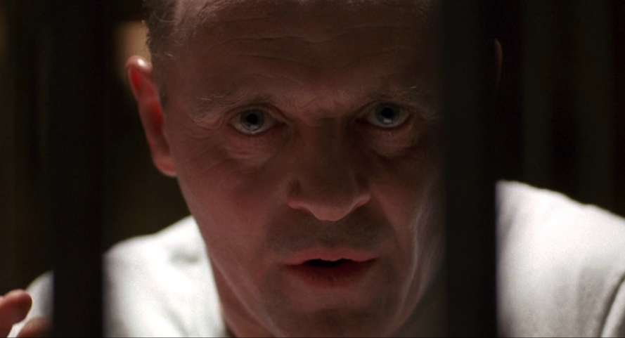
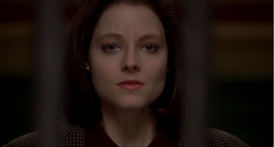
You’ll be hard pressed to find any filmmakers who object to the craft in this scene from Silence of the Lambs. These landmark closeups foster immense tension, placing us in a very specific mood.
The obstruction of vertical bars reminds us: one person is behind, and the other is in front of them. This instantly sets a tone, and the actors’ faces define the characters’ relationship.
If Demme left out the sequence where Jodie Foster enters the prison, cutting directly to these closeup interactions, the audience would still know exactly where they were, and what dynamics were at play.
Compared to the frame from Se7en, in Pitt and Paltrow’s kitchen, we see an important distinction: you can create the miseenscene in a full space, or it is present in a simple touch.
Remember the power of these two vertical bars as you construct relationships through mise en scene.
MISE-EN-SCENE & ACTION
I love the Bourne trilogy as much as anyone else, but it’s HARD for me to place myself in Bourne’s head, or in the action—especially in Supremacy and Ultimatum.
Action sequences have become inordinately complicated in the past decade or-so. Fast cuts and shaky camera have made them almost impossible to follow. Anymore, it’s rare that filmmakers place heavy value on mise en scene’s effect on action sequences.
If you want to make action films at any budget or scale, you could set yourself apart by going a different way.
Here is a spectacular example of filmmakers going against the current:
The filmmakers crafted an action sequence around an environment with clear implications, and let the environment push the suspense. What begins as a botched heist becomes a struggle for survival in an unruly place.
This was a found location, which makes the results even more palpable for filmmakers on a budget. All locations have risks—from passing cars, to staircases, and furniture.
Designing action around set pieces, or designing set pieces around action, enhances believability, uniqueness, and how riveting a sequence is—if the environment is a factor, potential for danger is endless (also seen in the above Blade Runner image).
At any budget-level, all that is required is some time, attention, and a boatload of creativity, which is why we’re all here making films!
Check out the early works from Freddie W. and Film Riot for some great examples of filmmakers using places and things within reach to create compelling and fun action.
These examples aren’t production design-related in the traditional sense, but with attention to setting the stage, filmmakers can bring old-fashioned flavor to cutting-edge work.
THE TAKEAWAY
Production design is more than prop placement, and repurposing locations
Mise-en-scene is for the audience—it’s a filmmaker’s opportunity to construct the world surrounding their characters. As with every milestone in the filmmaking process, it takes vision and planning.
If you’re writing your own screenplay to produce, you can write with production design in mind, crafting a story that you’re confident you can bring to life, under any constraints. As I discussed in this post, it’s crucial to get to know your film’s world at every level of filmmaking.
When working with a decent sized crew, you have all the help you need. It is on you to collaborate well and clearly articulate your vision.
With money to build sets, you have full control, and the challenge is to fabricate authenticity.
If you have a bare-bones crew, keep it simple: find existing, accessible locations that help tell your story.
And remember: there’s no shortage of interesting places in the world. Pair them with interesting people and stories!
How do you design sets, with limited resources? Help other filmmakers by telling us in the comments, below! Thanks for reading!
This is a remarkable tutorial I find it extremely useful as a teacher and I think students will benefit from it immensely
Thanks for the kind words, Amit. I hope you’ll be able to incorporate it into your teaching.
Cheers!
Very good information Michael, Thanks Amit for sharing this.
Thanks, Luke! Really glad you found it useful!
I’m a still photographer and I think this is a fabulous article. I’m bookmarking it for later reference.
Just a brief observation, in the infographic at #9 Composition, I think the first two examples have their image and caption swapped.
Thanks so much, Jim! Good call on #9, we’ll need to update it!
yes this is a very rich article
Thanks, Michael! Glad you liked it!
I find this article very interesting and educative…good work and thank you.
This short film I shot in a single bed room flat…we designed the hall as a bar(given our shoe string budget,hardly$800)and used the bed room as lead actor bed room,and cleared the hall after completetion of scenes set in bar,then we partitioned the hall used as antagonists office space..then we were bunch of amateurs trying to sharpen up our skills..
Thanks so much, Anand! Glad you enjoyed it!
This site is absolutely fabulous!
Thanks Shaneka!